
Why Fans Attach Meaning to Symbols, Colors, and Album Eras
A fan can sometimes recognize an album era from one cropped image.
Not the full cover. Not the artist’s name. Maybe only a color palette, a jacket, a stage light, a typeface, or the corner of a poster that used to appear everywhere during that period.
That is how visual memory works in music fandom. The sound may be the reason someone became a fan, but the images often become the way that sound is stored.
An album cover can bring back the first time a listener entered a record. A logo can make an old band visible to people who have not heard a full song yet. A color can help a crowd feel like one body from far away. A tour poster can preserve the shape of a night after the concert itself is gone. A fan edit can turn one performance photo into the image everyone associates with a song.
This is why fans attach meaning to symbols, colors, and album eras. They are not only responding to design. They are using visual objects to keep music close when the music is not playing.
In the larger story of music fan culture, these images matter because they give sound a second life. A song enters through the ear, but the cover, logo, color, poster, and era image give fans something they can see again later.
When Music Gets a Visible Body

Music itself disappears quickly.
A song plays, fills the room, and ends. The listener can replay it, but the actual moment of hearing passes. Visual identity gives music something more stable to attach to.
That does not mean every image becomes meaningful. Many covers, logos, and color choices remain ordinary. They do their job and fade away. But some visuals stay because fans start using them as shortcuts back to a specific feeling.
A record-store shelf can do this. So can a streaming thumbnail, an old tour photo, a fan-made wallpaper, a vinyl sleeve, a stage backdrop, or a shirt worn for years until the print begins to crack. The image becomes part of how the music is remembered.
This is different from branding alone. Branding tries to make an artist recognizable. Fan meaning happens later, after people have lived with the music long enough for the image to carry more than promotion.
A cover no longer feels like packaging.
A logo no longer feels like a label.
A color no longer feels like decoration.
Once fans attach real listening history to those visuals, they become part of the music’s emotional furniture.
Album Covers Before the First Track
An album cover is often the first doorway into a record.
Before the opening track begins, the image has already suggested a mood. It may look cold, damaged, theatrical, intimate, handmade, futuristic, religious, messy, polished, lonely, or dangerous. The listener has not heard the music yet, but the cover has already framed the room they are about to enter.
That first impression can last for years.
A fan may forget the exact date they first heard an album, but remember the artwork clearly. They remember seeing it on a record-store wall, a streaming app, a parent’s shelf, a friend’s recommendation, or a late-night search. The visual becomes attached to the first act of curiosity.
Over time, the cover and the sound become difficult to separate. The artwork starts to feel like the album’s face. When the fan sees it again, they do not need to press play immediately. The mood returns before the first note.
This is why album art can become so personal. It does not only identify the record. It helps preserve the listener’s way into it.
A song can become tied to a life chapter, which is explored in why certain songs become personal time capsules. An album cover works differently. It gives that chapter a visible front door.
Colors That Fans Learn to Recognize
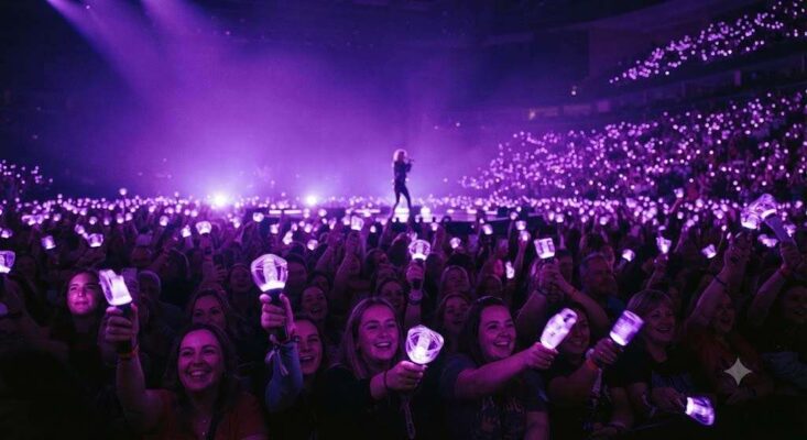
Color can work faster than explanation.
In some fandoms, a certain color appears so often that fans begin to treat it almost like a shared signal. It shows up in stage lighting, social posts, anniversary projects, fan edits, lightsticks, album packaging, tour visuals, or clothing. After enough repetition, the color stops feeling random.
It begins to carry association.
The important part is not the color by itself. Purple, black, red, blue, green, silver, or gold does not automatically mean anything in isolation. Meaning comes from repeated use, community recognition, and the moments fans attach to it.
A color may remind fans of a specific era. Another may recall a tour. Another may belong to a fandom project, a healing message, a darker album cycle, or a visual identity that made an artist suddenly feel more mature. Fans do not need to explain all of that every time. The color does part of the work silently.
This is why color can make fandom feel visible in public. In a concert crowd, thousands of lights in the same shade can turn individual listeners into one visual field. Online, a color used in avatars, banners, or fan edits can let people recognize the same emotional reference without saying much.
Color becomes meaningful because fans keep returning to it.
Not because it is special by itself, but because it has been used often enough to collect memory.
Logos That Travel Farther Than Songs
A strong logo can move through the world even when the music is not playing.
It appears on patches, posters, tattoos, old flyers, profile pictures, stickers, guitar cases, record sleeves, and shirts worn by people who may be longtime fans, new fans, or simply curious about the image. That visibility gives logos a special role in music culture.
A logo can become an invitation.
Someone may see a Black Sabbath mark, a Grateful Dead skull, a Metallica logo, a Nirvana smiley, a Pink Floyd prism, or another recognizable symbol before they know the full catalog. The image creates a question: what kind of music created this much visual loyalty?
That question can lead to listening.
For legacy bands, this matters a lot. A logo can outlive the original release cycle and keep meeting people decades later. It does not carry the whole history by itself, but it can point toward it. This is one reason older bands keep finding new generations of fans. Their symbols remain visible enough for new listeners to enter from the outside.
A logo begins as identification, but fans can turn it into something heavier. It can carry concerts, arguments, album eras, friendship, teenage discovery, old scenes, and the feeling of belonging to a sound that other people recognize too.
The design starts the mark. Fan use gives it weight.
Album Eras as Visual Chapters

Fans rarely remember an album era as only a release date.
They remember the look of it.
The first teaser image. The cover reveal. The new styling. The change in typography. The video colors. The press photos. The stage design. The tour poster. The sudden shift from one visual mood to another.
An era matters because it gives artistic change a visible form.
Sometimes the shift is dramatic. A band becomes darker. A pop artist becomes more stripped-down. A metal group adopts cleaner design after years of rougher imagery. A K-pop group moves from youthful brightness into something more wounded or cinematic. A legacy act returns with visuals that try to connect the old audience and the new one.
Fans notice these changes because they are not only watching an artist rebrand. They are watching a chapter close and another one begin.
The strongest eras become tied to the fan’s own timeline. Someone may remember the year through the album’s colors, the tour visuals, the outfits, the fan edits that filled their feed, or the poster they saved but never printed. The artist’s visual change becomes a marker for the fan’s life at that time.
That is why era endings can feel emotional. To an outsider, one promotional cycle has ended. To a fan, the visual world they had been living with for months or years has stopped expanding.
The next era may be exciting, but it is not the same room.
Posters and Stage Images After the Night Ends
Concert visuals preserve something that sound alone cannot.
A tour poster, stage photograph, setlist image, ticket design, or venue flyer ties music to a specific place and time. It reminds fans that a song was not only recorded or streamed. It happened somewhere, in front of people, under a certain design, on a particular night.
This is especially powerful for live-focused music cultures.
A Grateful Dead poster can suggest an entire concert world: improvisation, road life, hand-drawn style, venue history, and a show that fans still talk about through recordings and setlists. A metal tour poster can preserve the force of a lineup and scene. A pop tour visual can define how fans remember the scale, color, and emotional tone of a performance.
The poster is not the concert, but it gives the concert an afterimage.
That connects naturally to why live music feels different from recorded music. A concert disappears as soon as it happens. Visuals help fans keep part of it in view.
A fan may not remember every transition between songs, but they may remember the lights during the opener, the backdrop behind the encore, or the poster that later became the image of that night in their mind.
Live music leaves the room. Visual memory keeps a trace.
Everyday Objects That Carry Fan Meaning
Not every music symbol stays on official material.
Fans carry images into ordinary life.
A sticker on a laptop. A patch on a denim jacket. A tattoo behind the arm. A phone wallpaper. A profile avatar. A poster above a desk. A lyric graphic saved in a camera roll. A small logo on a notebook that nobody else in the room notices.
These objects can be public, private, or somewhere between the two.
Sometimes the fan wants recognition. They want another listener to notice the symbol and understand the reference. Other times, the image is mainly for the fan themselves. It keeps the music near during work, school, travel, grief, boredom, or daily routine.
This is where visual identity crosses into self-expression. The larger question of taste and selfhood belongs in why music taste becomes part of personal identity, but symbols make that identity visible in small ways.
A person does not always need to explain why a band matters. They may simply keep the image close.
That quiet use is important. Fan meaning is not always loud. Sometimes it is a tiny object that helps someone carry a whole music world into an ordinary day.
Fan Edits and the Unofficial Archive
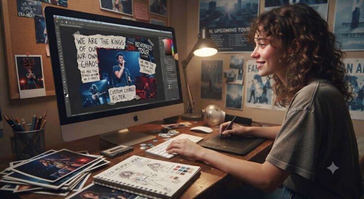
Fans do not only receive official visuals. They keep making new ones.
A performance photo becomes a wallpaper. A lyric is placed over a blurred concert image. An old logo is reworked in a new style. A video clip becomes the reference everyone uses for a certain song. A fan-made timeline places album covers, outfits, colors, and tour moments into order.
These unofficial images matter because they show which visuals the community actually remembers.
An artist may release dozens of official photos, but fans often decide that one image captures the era better than the rest. A single live shot can become more emotionally important than a polished promotional image. A low-resolution clip can circulate for years because it holds the feeling of a performance better than the official upload.
Fan edits are not just decoration. They are a form of memory work.
They help fans decide what the era looked like, which moments mattered, and how the music should be visually remembered. This overlaps with how music fandom turns songs into a shared language, because images can become part of how fans communicate without long explanations.
Official visuals introduce the frame. Fans decide which frames stay alive.
The Difference Between Branding and Fan Meaning
Many music visuals begin as branding.
That is not a bad thing. Artists, designers, labels, and creative teams use covers, logos, colors, and era concepts to make a release recognizable. Good visual identity helps music travel.
But branding and fan meaning are not identical.
Branding is planned before the audience fully lives with the work. Fan meaning happens afterward. It forms through repeated listening, concerts, posts, saved images, personal associations, arguments, jokes, grief, discovery, and time.
A logo can be well designed and still mean very little if fans do not attach life to it. A color can be chosen carefully and still fade after the campaign ends. An album era can look expensive and still disappear quickly if it does not become useful to listeners.
The visuals that last are not always the most polished. They are the ones fans keep using.
That is why a faded tour poster, a rough bootleg cover, or an old fan edit can sometimes feel more meaningful than a perfect official graphic. The value comes from use, not just design quality.
Branding introduces the image. Fan culture tests whether the image can hold anything.
What Visuals Leave Behind
When the song ends, something often remains visible.
The album cover stays in the library. The poster stays on the wall. The logo stays on the shirt. The screenshot stays in the phone. The fan edit stays in a saved folder. The tattoo stays on the skin. The color returns whenever fans gather around the same reference.
These objects do not replace the music.
They help fans return to it.
That is why symbols, colors, and album eras matter so much in music fandom. They give sound a visible afterlife. They help listeners remember where they entered, which version of the artist they met, what the music looked like during a certain period, and how a community learned to recognize itself.
A song may be the center of the experience, but the image often becomes the handle fans use to pick that experience back up.
The strongest music visuals do not only look good.
They bring the sound back before the song begins again.